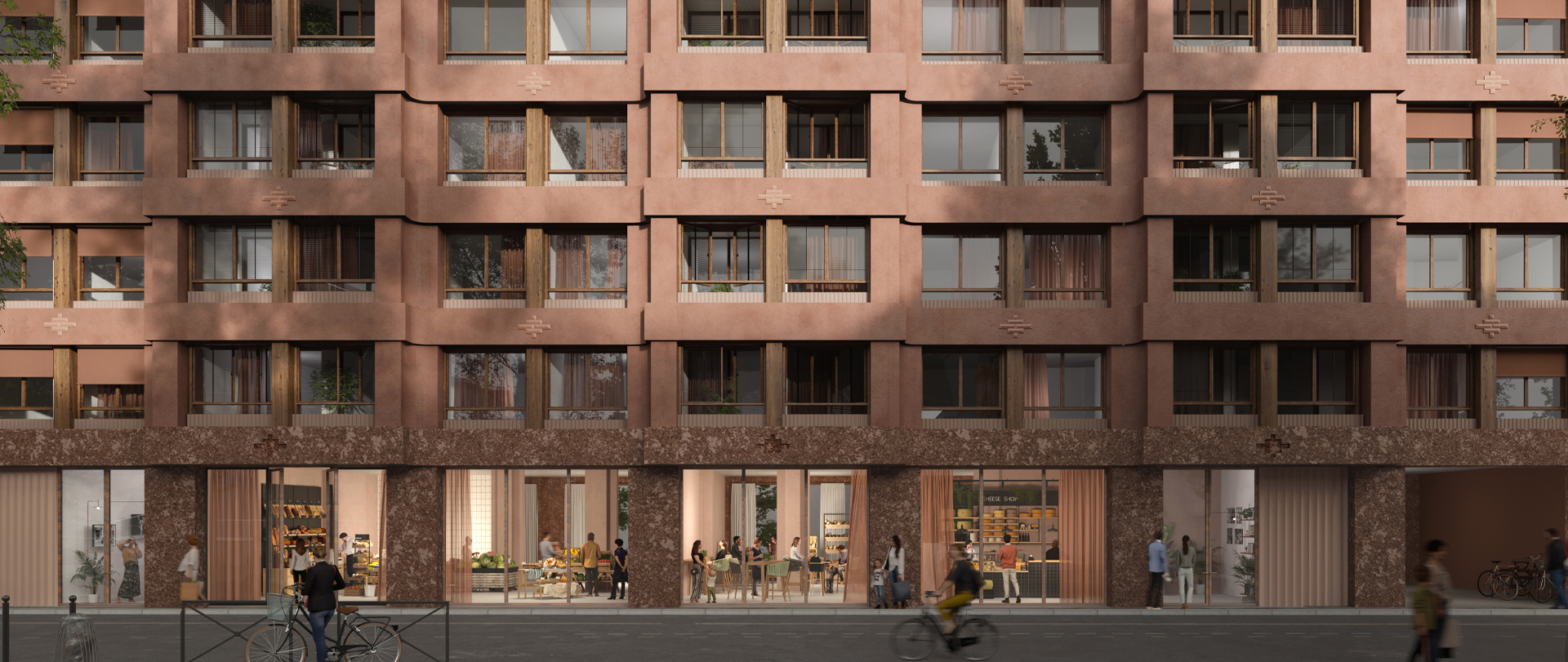
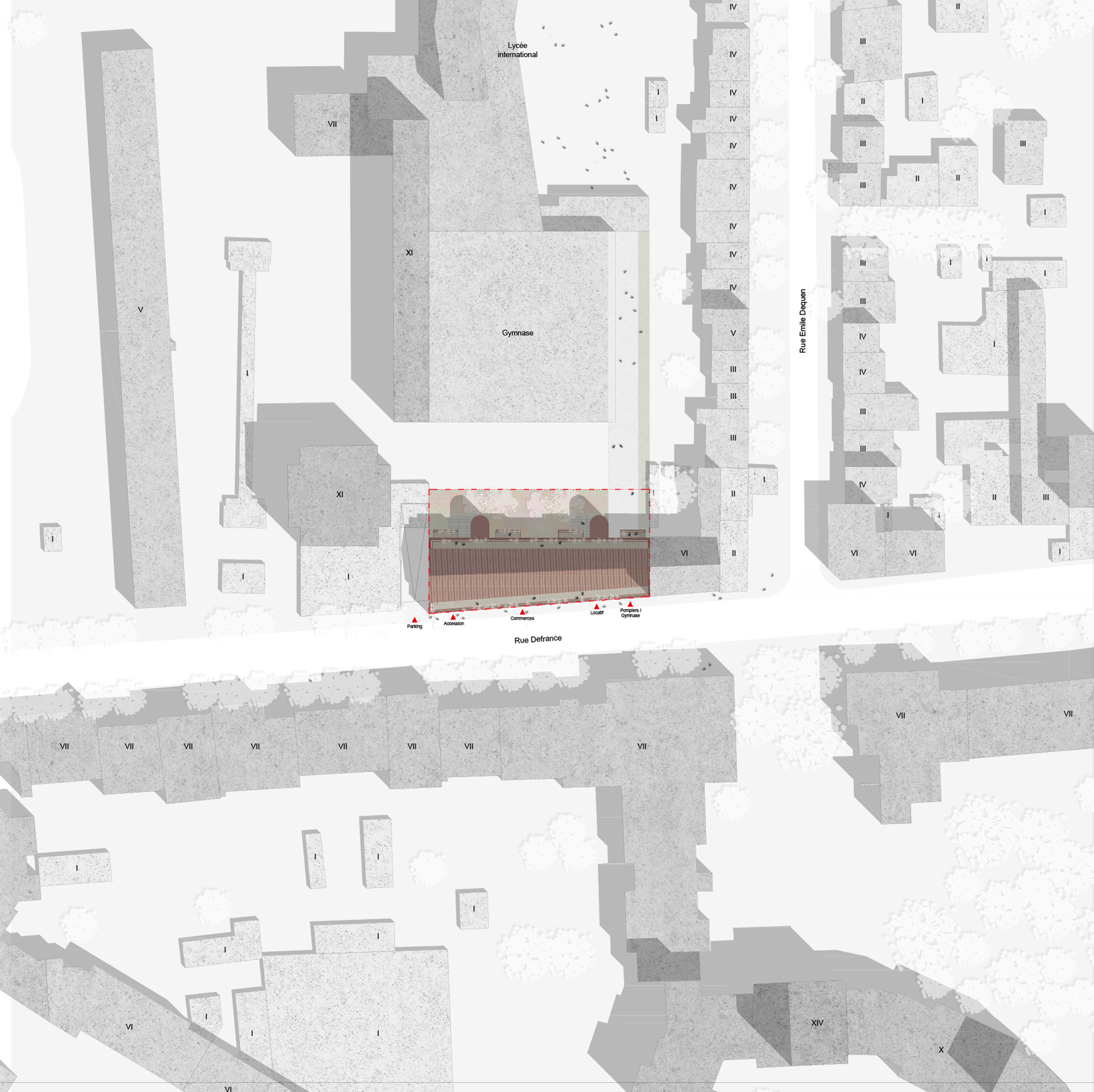
The project is located on one of Vincennes' main axes, rue Defrance. The positioning of the project on the plot is optimal, not only to fit seamlessly on the street in a diverse urban fabric, but also to open up appropriately according to the views towards the wider landscape.
Our project aims to harmonize the site with its surrounding urban system:
. It reinforces the liveliness of the garden through the transparencies it creates, while at the same time creating an active base open to the city and a living facade.
. It creates a peaceful back garden that distances the gymnasium facade.
The linear ground plan and the adjoining buildings create a dense building front. The composition of the volume into a base I body I recessed attic, helps to reduce the density. The four-storey body gives the building its urban scale and ensures perfect continuity with the neighbouring development. The recessed attic will attenuate the building's scale by highlighting the sky line. Like the base, the body aligns with the fabric of Vincennes.
The building envelope is one of the key elements of the sustainable and environmental design. Its materiality reflects the values of the project. Although wood is present in the structure, it will be protected on the façade to ensure the building's longevity. It will remain visible on the joinery only. The concrete base, tinted solid, provides a solid foundation for the building. On the solid body, two materials are used to ensure the durability of the project: lime/earth coating on fermacell and mass-tinted crenellations. The ornamentation is in reused bricks.
A subtle combination of depths, loggias and rhythmic variations makes the facades vibrate. The main facade on the street side is widely exposed, so it is designed in all its thickness. Its envelope, designed for the most part as a double skin, generates a new typology of interior/exterior spaces that :
. play a dual role, both acoustically and thermally.
. ensure privacy from the street, while offering unobstructed views.
. provide a multi-purpose living space for all seasons.
The project is designed according to the different orientations. The skin on the rear facade is designed inversely to the envelope on the street. The presence of balconies for all garden-facing units, coupled with the two stairwells, ensures a dynamic façade.
Large units are systematically through-plan. The smaller units on the west side of Antin are double-oriented. Only the small central units are mono-oriented, and south-facing. The latter feature insulated loggias on both skins to combat overheating. These units can easily be twinned in the future to create through-apartments.


